
The GMAT got a big makeover in 2023 with the launch of the GMAT Focus Edition, and one of the biggest updates is the new Data Insights section. This fresh section brings together parts of the old Integrated Reasoning and Data Sufficiency sections, all wrapped into one. It's built to test how well you can understand, interpret, and break down different types of data—an essential skill in today’s data-driven business world. What’s interesting is that Data Insights now carries the same weight as the Quant and Verbal sections. Yep, each section makes up about a third of your total score. That means you can’t afford to ignore it if you're aiming for a solid overall score. Basically, the GMAT is telling us loud and clear: if you want to succeed in business, you need to be smart with data.
One major piece of the Data Insights puzzle is Graphics Interpretation (GI) questions—they typically make up 20% to 30% of the section. These questions are all about how well you can read charts, graphs, and visuals, and pull meaningful insights from them. Since they take up such a big chunk of the section, it’s super important to spend time getting comfortable with these types of questions. In fact, doing well on GI can seriously boost your overall GMAT score.
But here's the thing—it's not just about the test. The focus on Graphics Interpretation reflects the real world of business, where professionals are always working with dashboards, charts, and reports. Business schools know this, and that’s why they look for candidates who can confidently handle complex data and visual info. So, if you get good at analyzing graphs now, you're not only prepping for the GMAT—you’re building a skill that’ll pay off in your MBA program and well into your career in our data-driven world.
Graphics Interpretation Question Type
Graphics Interpretation (GI) questions on the GMAT test your ability to understand and analyze visual data—think bar charts, pie charts, line graphs, scatter plots, Venn diagrams, flowcharts, and more. Each graph comes with a short text blurb that adds context, explains variables, or defines key terms. Don’t skip this text—it often contains crucial info not visible in the graphic itself.


After reviewing the graph and text, you’ll face one or two fill-in-the-blank statements, each with a drop-down list of answer choices. But here's the catch: you must get both blanks right to earn credit—no partial points!
GI questions test several core skills:
Extracting key data (reading values, understanding axes, spotting trends),
Interpreting relationships between variables,
Making logical inferences beyond what's explicitly shown,
Synthesizing info from both the graph and the text.
A smart strategy? Glance at the drop-down options first—they can hint at whether calculations or comparisons are needed. Pay attention to the phrasing, too; it can reveal patterns or relationships to watch for.
GMAT Graphs: Common Types and Their Nuances
The GMAT Data Insights section can present a variety of graph types within its Graphics Interpretation questions. Familiarity with these different formats is crucial for efficient and accurate analysis.
| Graph Type | Brief Description | Primary Use/Focus | Demo |
|---|---|---|---|
| Bar Chart | Uses rectangular bars to represent data values, with length or height proportional to the value. Can be simple, stacked, or grouped. | Comparing discrete categories of data, showing components of a whole, comparing groups. |  |
| Line Graph | Displays data points connected by lines, showing trends and changes over a continuous period. Can be single, multiple, or time series. | Illustrating trends, changes over time, relationships between variables. | 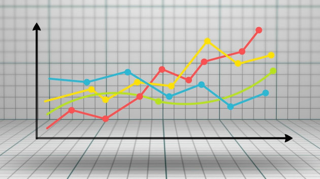 |
| Pie Chart | Circular chart divided into sectors, each representing a proportion or percentage of a whole. | Showing how a total quantity is distributed among different categories. |  |
| Scatter Plot | Displays data points as dots on a coordinate plane to explore the relationship between two variables. Bubble charts add a third variable through dot size. | Identifying correlations (positive, negative, or none) and trends between two variables. | 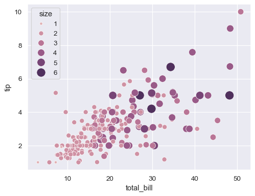 |
| Venn Diagram | Uses overlapping circles to illustrate the relationships between different sets. | Showing commonalities and differences between groups, set theory concepts. |  |
| Flowchart | Uses various shapes connected by arrows to depict a sequence of steps in a process. | Representing a process, outlining steps in a complex task. | 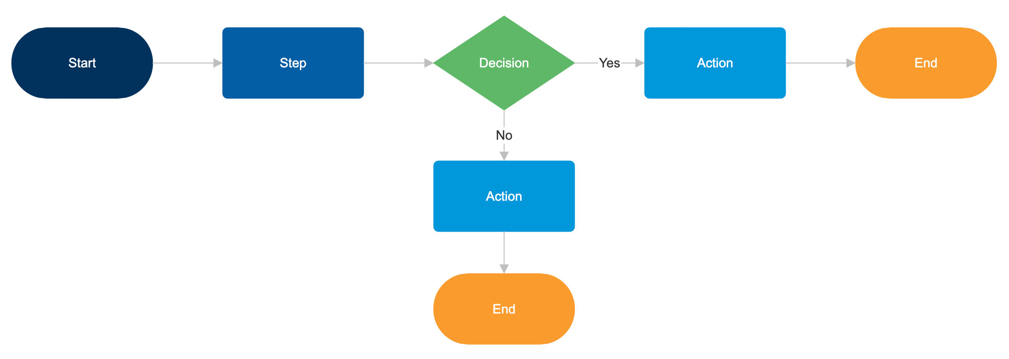 |
Bar charts are fundamental for comparing discrete categories of data. Simple bar charts display a single bar for each category, while stacked bar charts show different components within each bar, representing parts of a whole. Grouped bar charts present multiple bars side-by-side for each category, allowing for comparisons across different groups or time periods. When analyzing bar charts, it is crucial to focus on the labels of the axes to understand what is being compared and to pay close attention to the scale of the value axis. For stacked and grouped charts, the legend is essential for distinguishing between the different components or groups.
Line graphs are ideal for illustrating trends and changes in data over a continuous period, such as time. They display data points connected by straight lines and can show the relationship between two variables. Single line graphs track the trend of one variable, while multiple line graphs allow for the comparison of trends for two or more variables over the same period. Time series graphs specifically show data changes over time. When interpreting line graphs, the slope of the lines is a key indicator of the rate of change. Steep slopes signify rapid changes, while flat lines indicate stability. The direction of the slope (upward or downward) indicates whether the value is increasing or decreasing.
Pie charts are circular diagrams divided into sectors, where each sector represents a proportion or percentage of a whole. The size of each sector is proportional to the quantity it represents, making them most effective for showing how a total quantity is distributed among different categories. The sum of all sectors in a pie chart always equals 100% or the total quantity. When analyzing pie charts, the focus should be on the relative sizes of the sectors, with larger sectors indicating a greater proportion of the whole. The labels or legend are crucial for identifying what each sector represents and the corresponding percentage or value.
Scatter plots display individual data points as dots on a Cartesian plane, with each dot representing the values of two different variables. Their primary use is to explore the relationship or correlation between these two variables. The pattern of the dots can indicate a positive correlation, a negative correlation, or no correlation. A variation is the bubble chart, where the size of each dot represents a third variable. When analyzing scatter plots, look for the general trend of the data points. If the points tend to form a line or curve, it suggests a correlation. The direction of the line indicates the type of correlation, and the tightness of the points around the line suggests the strength of the correlation.
Beyond these common types, the GMAT Data Insights section might also include less conventional visual representations. Venn diagrams use overlapping circles to illustrate the relationships between different sets. Flowcharts depict a sequence of steps in a process using various shapes connected by arrows. Network diagrams show connections between entities , and tree diagrams illustrate hierarchical structures. For these less standard graph types, the key is to carefully read the accompanying text to understand the meaning of each element and how they represent the data and relationships being tested.
Demo Questions With Answers
Q1.


Solution:

Q2.


Solution:

Q3.


Solution:

Q4.


Solution:

Q5.


Solution:

Avoiding Common Mistakes in Graph Interpretation
One common mistake in Graphics Interpretation is rushing to answer without fully understanding the graph and text. Take a moment to review titles, labels, and scales before jumping in.
Another error is misreading scales, units, or labels, which can lead to incorrect answers. Always double-check axes and measurements.
Overlooking small details, like footnotes or data points, is also risky. These can contain key info, so scan everything carefully.
Avoid making assumptions not backed by the data. Stick to what’s shown—don’t add your own interpretations.
Lastly, don’t get lost in irrelevant info. Focus only on the parts of the graph and text that relate directly to the question.