Importance of Data Interpretation
Imagine you're the Sherlock Holmes of the GRE, tasked with unravelling the mysteries hidden within numbers, graphs, and tables. The Data Interpretation section isn't just about crunching digits; it's about deploying your detective skills to analyse data, spot trends, and draw insightful conclusions. It's like being handed a treasure map, but instead of gold doubloons, you're unearthing correct answers—arguably more valuable in the context of the GRE!
But why is this so crucial? Graduate programs are keen to see if you can navigate the labyrinth of real-world data, whether that's in a business setting, scientific research, or even determining the optimal number of pizzas to order for a study group based on survey results. Excelling in Data Interpretation showcases your ability to make sense of complex information, a trait that distinguishes a stellar student from one who's merely coasting.
Consider this: according to data from the Educational Testing Service (ETS), the mean score for the Quantitative Reasoning measure of the GRE is approximately 156.93, with a standard deviation of 9.89. This indicates that a significant number of test-takers find this section challenging. However, with effective preparation, you can position yourself above this average, enhancing your competitiveness for graduate admissions.
And here's the kicker: mastering this section isn't just about acing the test—it's a life skill. Picture yourself confidently analysing your budget, tracking fitness progress, or even engaging in spirited debates with friends over whether pineapple belongs on pizza (the data might surprise you!). So, embrace Data Interpretation with enthusiasm, because honing these analytical muscles will not only make you a GRE superhero but also equip you with tools for everyday decision-making.
Overview of Common Data Formats
In the GRE Data Interpretation section, you’ll encounter data presented in a few classic styles. Think of these as the “languages” data uses to communicate with you. Here's a quick rundown:
Pie Charts: These are like delicious pizza slices, but instead of pepperoni, they show proportions of a whole—like how your monthly budget is spent (hint: way too much on coffee).
Bar Graphs: Imagine a line-up of colourful bars competing to tell you which category wins. Whether it's comparing sales across regions or the number of times you’ve hit snooze, bar graphs make comparisons easy.
Line Graphs: These are your go-to for spotting trends over time. Picture a rollercoaster ride of data showing stock prices, temperature changes, or even how your caffeine intake spikes during GRE prep.
Tables: The no-nonsense format that lays it all out. Tables are like spreadsheets—clean, detailed, and perfect for quick comparisons, whether it’s grades, revenue, or how much Netflix you’ve binged this week.
By getting familiar with these data formats, you’ll feel like a data whisperer, able to read and interpret them with ease. And who wouldn’t want that superpower for the GRE—and life?
Understanding GRE Data Interpretation
Definition and Purpose
GRE Data Interpretation is all about testing how well you can make sense of numbers and visuals, like graphs, charts, or tables. It’s not just about doing math; it’s about figuring out what the data is trying to tell you. Think of it as reading a story, but instead of words, the story is told through numbers and trends.
Why does this matter? Graduate schools want students who can solve real-world problems using data. Whether you’re analyzing survey results, market trends, or even your personal budget, being good at interpreting data shows you can think critically and make smart decisions. It’s like training your brain to connect the dots and uncover the bigger picture—which is a superpower both in school and in life!
Question Formats
GRE Data Interpretation comes in two main question types:
Multiple-Choice Questions:
These are the classic "pick the right answer" kind of questions. Some will give you five options, and you choose one. Others might ask you to select multiple correct answers, so you’ll need to be extra careful.
Numeric Entry Questions:
These are a bit different—you’ll calculate an answer and type it into a box. There’s no list of options to choose from, so no lucky guessing here! You either know it or you don’t.
Both question types test how well you can read, analyse, and use the data provided. The key is to stay calm, take your time to understand the data, and double-check your calculations. Remember, it’s not about rushing but about being accurate.
And don’t worry—like any skill, you’ll get better at this with practice!
Effective Strategies for Data Interpretation
Thoroughly Analyse the Data
Before diving into the questions, take a moment to really study the data. Look at every part of the graph, chart, or table—titles, axes, scales, and units. Think of it as meeting someone new: you wouldn’t make assumptions without getting to know them first, right? The same goes for data. A few extra seconds spent understanding the big picture can save you from costly mistakes later.
Identify Key Information
Every graph or table has a story to tell, and the titles, labels, and legends are the storytellers. They give you clues about what the data represents and what’s being measured. For example, is the graph showing percentages or actual numbers? Are the axes measured in years, days, or light-years? Pay close attention to these details so you don’t misinterpret the data and end up with a wrong answer.
Practice Estimation Techniques
Sometimes, you don’t need to calculate the exact answer to solve a question. Learning to estimate quickly can be a huge time-saver. For instance, if a graph shows that sales were “around 50,000” last year, don’t waste time calculating precise figures if an approximate value will do. Estimation is like having a shortcut that gets you to the right answer faster—just make sure it’s a reliable shortcut!
Manage Time Effectively
Time management is key for GRE success, especially in Data Interpretation. Allocate a reasonable amount of time to each question and move on if you get stuck. Spending too much time on one tricky graph could leave you rushing through easier questions later. A good rule of thumb: if a question feels like quicksand, don’t sink—skip it and come back if you have time. Staying calm and steady is the best way to ensure you finish the section without feeling overwhelmed.
With these strategies in your toolkit, you’ll be ready to tackle Data Interpretation like a pro. It’s all about practice, focus, and a little bit of patience!
Some Other Strategies
- Eliminate incorrect options to narrow down your choices.
- Break complex data into smaller, manageable parts.
- Look for patterns and trends in the data.
- Double-check units, scales, and labels before solving.
- Be cautious when interpreting percentages and ratios.
- Use scratch paper for calculations and notes.
- Read the question carefully to focus on relevant information.
- Practice under realistic test conditions to improve speed and accuracy.
- Stay calm and confident, even when faced with challenging questions.
Example with Step by Step Solution
Pie Chart Analysis
Question:
A company's annual revenue of $500,000 is divided among four departments as follows:
- Marketing: 30%
- Research & Development: 25%
- Operations: 20%
- Sales: 25%
How much more revenue does the Marketing department receive compared to the Operations department?
Solution:
Find the revenue for each department:
- Marketing: 30%×500,000=0.30×500,000=150,000
- Operations: 20%×500,000=0.20×500,000=100,000
Calculate the difference:
- 150,000−100,000=50,000
Final Answer: $50,000
Bar Graph Analysis
Question:
A bar graph shows the number of students enrolled in a university over five years:
- 2019: 4,500
- 2020: 4,800
- 2021: 5,300
- 2022: 5,600
- 2023: 6,200
Estimate the average annual increase in student enrolment.
Solution:
- Find the total increase in students from 2019 to 2023: 6,200−4,500=1,700
- Find the number of years: 2023−2019=4 years
- Estimate the average increase per year: 1700/4=425
Final Answer: Approximately 425 students per year
Line Graph Analysis
Table Data Analysis
Question:
A table shows the sales of different laptop brands in a store over three months:
| Brand | January | February | March |
|---|---|---|---|
| A | 150 | 180 | 210 |
| B | 200 | 190 | 220 |
| C | 250 | 270 | 300 |
What is the total sales of Brand B over the three months?
Solution:
Add the sales for Brand B across all months: 200+190+220=610
Final Answer: 610 laptops
Common Pitfalls to Avoid
Misinterpreting Data
One of the biggest mistakes is misreading the data presented in graphs, tables, or charts. Take your time to fully understand what the data represents, including titles, labels, and units, to avoid drawing incorrect conclusions.
Overlooking Details
Small details, like units of measurement, axis scales, or legends, can change the entire meaning of the data. Always double-check these elements to ensure you don’t miss something important that could affect your answer.
Confusing Percentages with Actual Values
Percentages can be tricky if you don’t know what they’re referring to. Always relate percentages to the total values they represent and perform the necessary calculations to avoid incorrect interpretations.
Additional Pitfalls to Avoid
- Rushing through the data without fully understanding it.
- Misjudging trends or patterns in graphs and charts.
- Ignoring changes in scale between multiple graphs or tables.
- Relying solely on visual estimations without calculating.
- Misreading multiple-choice questions or answer options.
- Assuming all data in the chart is relevant to the question.
- Forgetting to consider units when performing calculations.
- Spending too much time on one question and running out of time.
- Misinterpreting numeric entry formatting or rounding incorrectly.
By being mindful of these common pitfalls, you’ll be better equipped to tackle Data Interpretation questions with confidence and precision.
Some GRE Problems with Step by Step Solutions
Question set 1
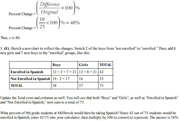
Solution set:
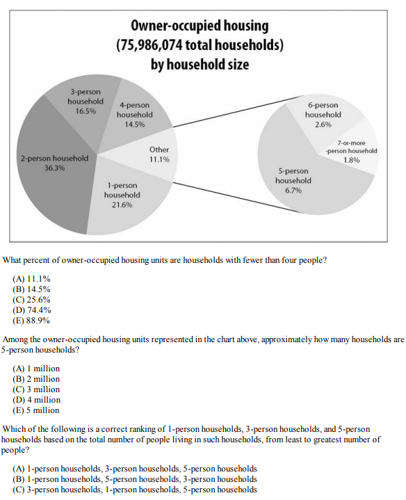
Question set 2

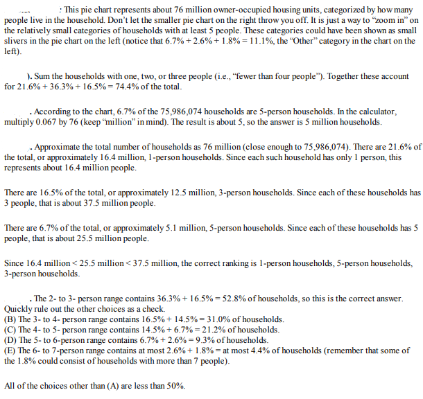
Solution Set:
Question Set 3
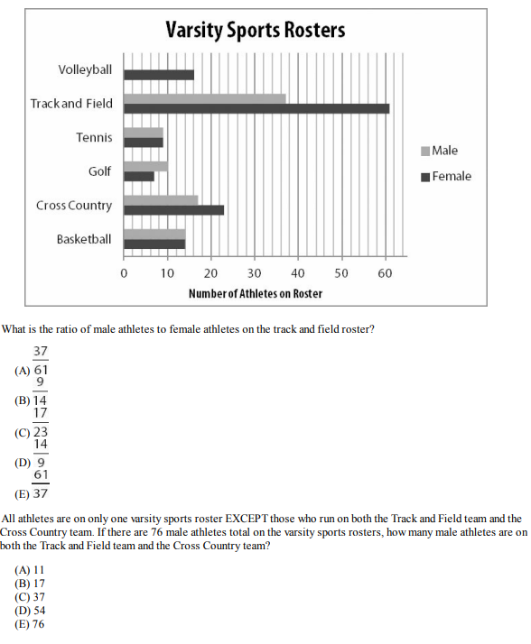

Solution Set:
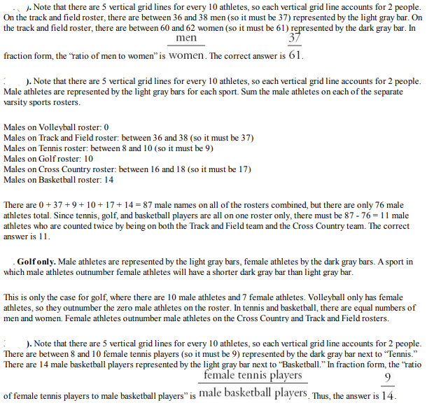
Question Set 4
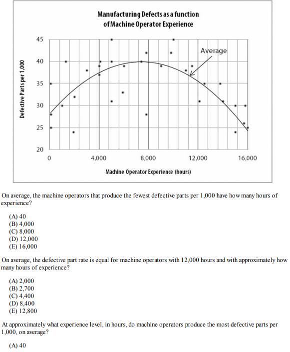

Solution Set:
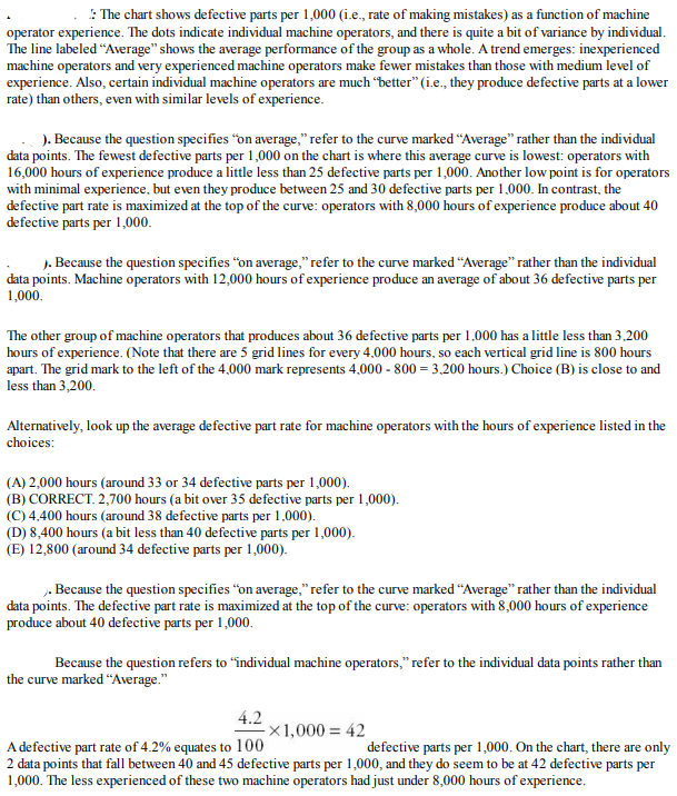
Conclusion
Conquering Data Interpretation on the GRE is more than just solving math problems—it’s about mastering the art of analysing data and building your confidence along the way. Did you know that according to ETS, the average Quantitative Reasoning score is around 156.93, with a standard deviation of 9.89? This means excelling in sections like Data Interpretation can give you a real edge over other test-takers.
By staying focused, carefully analyzing data, managing your time wisely, and practicing consistently, you can push yourself into the top percentiles. Remember, each practice session brings you closer to your target score, and every mistake is just a stepping stone to improvement.
Keep putting in the effort and trust in your ability to succeed. You’re capable of more than you realize—one step, one question, one victory at a time.
"Success is the sum of small efforts, repeated day in and day out." – Robert Collier
